Tag: css
Hey folks, I’m back to talk about an app project from my day job.
A prototype website and companion app for a rewards scheme that allowed users to get discounts when they shopped at participating retailers as well as donating a portion to a charitable organization of their choice.
My team and I built the frontend, while a sister team worked on the backend.
Continue reading “Reward program website and app”Greetings one and all, today we’ll be taking a look at another bit of concepting/messing around from the start of 2015. This time we’ve got an animation of some flying reindeer!
This follows on from the settling snowfall effect I’ve covered previously. This project was started directly after, but never reached the same level of completion.
Continue reading “Flying reindeer animation”In early 2015 I was given a brief to create a mobile sales app for my employers travelling salespeople to use when they visit customers. I had to rush a prototype out in 4 days which was barely functional but largely UI complete.
A few more weeks of work and it all came together. There’s still a few feature gaps and such but all the important stuff is there.
Continue reading “Remote Sales App”A quick look at another website build for Christmas tree wholesaler/retailer, Jadecliff.
Quick web project today – a website for a local scaffolding company atop WordPress. This was back in 2013 and having never used WordPress for anything other than this blog before it was a learning curve.
Above the fold features the nav, a service guarantee, various accreditations and a short slideshow of sample jobs, and from there we break in to three columns to enumerate the types of work the company will undertake.
That’s all folks, thanks for reading.
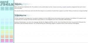
Before the current Nerdshack, and before the previous Nerdshack, there was the original Nerdshack – the same site really, blog, portfolio and random drivel, but in a more designed shell.
I recently found this single screenshot of the old design and figured I’d publish it for posterity. I still like it – those boxy headline backgrounds were based on the window frames from the Watercolour theme in Windows Whistler (XP) builds 2410-2419, and the boxy layout of the sidebar complimented it nicely.
In the final iteration, the lower boxes on the sidebar contained links to recent blog posts, and clicking any link in to the blog triggered a smooth transition to the identically laid out but much darker design of the blog. I’m currently investigating building a similar theme for the current site – the grey is nice but it is a bit depressing after a while!

One of my first “real” programming projects from around 2006/7, in collaboration with some friends, to create a rough image hosting service for use on our own forums.

At the time our server had just moved to an “unlimited everything” plan, and we basically wanted to test it out, as well as the obvious benefits of hosting our own images.
I was the in-house developer, but I was only familiar with HTML, CSS, and a smidge of Javascript if required, so I didn’t have the chops to take on such a project. Luckily another forum member who I’ve since lost contact with was in to php, and so he began building code.
Eager not to be left out and eager to learn php I started pulling down his code and studying it to figure out how everything worked.
In 2008/9 I visited a bar near where I lived called The Indie Lounge frequently. Friendly staff, live music and cheap drinks beckoned me in, but after a while I began work on an altogether more professional project with them – creating a website.
There was some interest in having an online presence which could be customized and styled, unlike the bars most prevalent means of communication at the time, Facebook. So I went and built a design I felt reflected the bar, grungy and dark. From there, things got a little strange…

Continue reading “The Indie Lounge website”

I recently completed a short project for an old friend of mine, redesigning the website for his hosting company.
As a teenager I was very active on technology discussion forums, and became the in-house developer for several. Modifying themes for Invision Power Board (now IP.Board), and tweaks to any external web sites or front pages were my general jobs, although I did make a few skins from scratch way back when.
The largest project I ever undertook was for a large community of over 30,000 members – the site had previously had a web site front end linked to their forum, but lost it during some upgrades. I created a new portal for them which linked in to their forums and displayed the top news posts, as well as most recent posts across the whole board, popular downloads, and a custom poll widget. I also created an extensive admin panel allowing admins to control exactly which forums the top/most recent posts were drawn from and set the poll.
Continue reading “IP.Board Portal”


